


Why Cake Box Packaging Matters for Brand Identity
The First Impression Is Often the Last
When a customer encounters your product for the first time, Cake Box Packaging is usually the first physical touchpoint they experience. Before they smell the cake, taste it, or even read your brand name, they see the box. This makes packaging one of the most powerful tools for shaping brand perception.
Packaging as a Brand Ambassador
Your packaging doesn’t just hold the product—it speaks on behalf of your brand. Whether it’s a handcrafted cupcake or a tiered celebration cake, the box it comes in communicates quality, values, and personality.
From Shelf to Social Media
In the age of Instagram and TikTok, Cake Box Packaging also plays a digital role. People share photos of beautifully packaged products, turning packaging into organic social media marketing. That makes your packaging not just a container, but a brand asset.
Choosing Brand Colors That Resonate
Color is often the quickest way to trigger brand recall. For a bakery or dessert brand, selecting the right palette for your Cake Box Packaging can evoke emotions—sweetness, luxury, joy, or nostalgia.
- Primary colors: Choose 1–2 colors that become your signature
- Accent hues: Complementary colors help highlight product names, flavors, or special editions
- Color psychology: Pastels may feel soft and comforting; bold hues may signal energy and fun
Testing Colors Across Different Materials
Colors on a screen look different from colors in print. Paperboard, matte finishes, and gloss coatings affect how color is perceived. It’s vital to:
- Check Pantone and CMYK matches
- Review printed proofs
- Test on the actual substrates used in production
This ensures your Cake Box Packaging colors stay consistent and true to your brand.
Maintaining Consistency Across Products
If you offer cakes, cupcakes, cookies, and pastries, your color system should be versatile. While the main brand colors stay constant, subtle variations (like color-coded accents) can help customers tell products apart while still feeling cohesive.
Fonts Communicate Brand Personality
Typography is more than letters—it reflects who you are:
- Serif fonts: Traditional, established, premium
- Sans-serif fonts: Modern, clean, accessible
- Script fonts: Elegant, artisanal, bespoke
- Display fonts: Purposeful, unique, brand-specific
When planning Cake Box Packaging, choose fonts that match the brand character you want to express.
Building a Type System for Packaging
Your typography system should include:
- Primary brand font: Used for brand name and headlines
- Secondary font: For ingredient lists, product descriptions
- Accent typography: For limited editions or seasonal offerings
Consistency in font usage keeps your Cake Box Packaging professional and harmonious.
Readability First
While creativity is encouraged, readability shouldn’t be compromised. Your text must be clear from a distance, especially on retail shelves where customers scan quickly.
Make Your Logo the Hero
Your logo is your brand’s signature. For Cake Box Packaging, it should:
- Be placed on the box’s primary face
- Be proportional to box dimensions
- Use approved colors only
- Remain unaltered and distortion-free
Logo placement needs to follow clear rules that are outlined in your brand style guide.
Logo Scale and Balance
Too small, and the logo gets lost. Too big, and it overwhelms the design. Good logo scale:
- Enhances visibility
- Maintains visual balance
- Aligns with other design elements like patterns or taglines
Protect Your Brand Identity With Clear Rules
Your brand guidelines should specify:
- Minimum logo size
- Clear space around the logo
- Safe placement zones on various packaging types
This protects brand integrity across all Cake Box Packaging iterations.
Beyond Logo and Color
Visual language refers to the visual cues that make your packaging recognizable even without your logo. This includes:
- Illustration style (hand-drawn, photographic, minimal line art)
- Patterns and textures (polka dots, stripes, floral)
- Graphic devices like icons or borders
Every element contributes to the feel of your Cake Box Packaging.
Choosing the Right Visual Motifs
If your brand personality is artisanal and handcrafted, your visuals should reflect that:
- Organic illustrations
- Soft textures
- Playful patterns
For premium, high-end brands:
- Clean minimal graphics
- Subtle embossing
- Luxurious finishes
Visual Consistency Across Formats
Your visual language must work on:
- Cake boxes of various sizes
- Labels and sleeves
- Gift packaging
- Seasonal wraps
A consistent visual language allows customers to instantly recognize your brand—even without seeing your logo.
Why Words Matter on Packaging
The text on your Cake Box Packaging is often overlooked—but it has tremendous impact. It tells stories, conveys values, and builds emotional connection.
Your tone should:
- Reflect brand personality (friendly, luxurious, playful)
- Be concise and memorable
- Be consistent across all product lines
Elements of Packaging Copy
Key areas to consider:
- Product names – Unique names make your cakes stand out
- Descriptions – Highlight ingredients, taste, experience
- Taglines and slogans – Short messages that resonate
- Story text – Short brand narrative on the back or inside flap
Legal and Informational Copy
Don’t forget essential details like:
- Ingredient lists
- Allergen warnings
- Certifications (organic, gluten-free, etc.)
Make sure these are integrated seamlessly into the design, keeping voice and aesthetics aligned.
Consistent Cake Box Packaging is far more than attractive design. It’s a strategic asset that:
- Strengthens brand recognition
- Communicates personality and quality
- Enhances customer experience
- Drives social sharing and loyalty
By mastering color, typography, logo usage, visual language, and tone of voice—and by documenting your standards—you can build a packaging system that grows with your products while strengthening your brand identity.
Packaging isn’t just a wrapper—it’s a brand-building engine. Start designing Cake Box Packaging that tells your story, delights your customers, and helps your brand stand out in a crowded market.
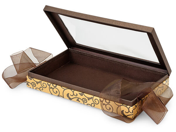
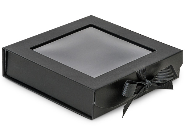
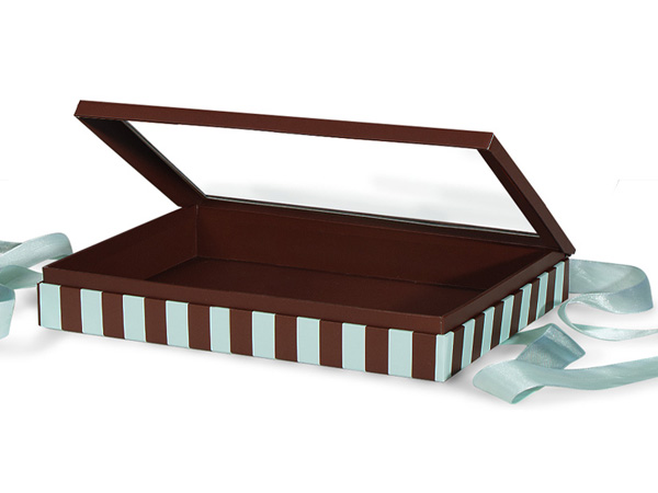
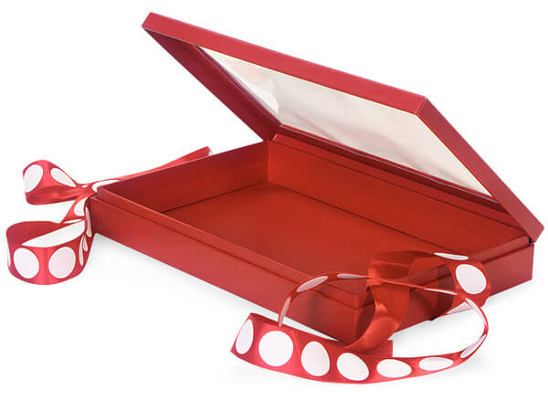
Cake Box Packaging is the physical packaging that holds and presents your cakes. It’s one of the most important brand touchpoints because it creates the first impression, communicates quality, and strengthens your brand identity. Well-designed packaging can also encourage social media sharing, turning your box into a marketing tool.
Choosing colors for Cake Box Packaging requires understanding your brand personality and target audience. Select 1–2 primary brand colors that are distinctive and consistent across all packaging. Consider color psychology—pastels for a soft, comforting feel or bold hues for a playful, energetic look. Always test colors on the actual packaging materials to ensure accuracy.
Choosing colors for Cake Box Packaging requires understanding your brand personality and target audience. Select 1–2 primary brand colors that are distinctive and consistent across all packaging. Consider color psychology—pastels for a soft, comforting feel or bold hues for a playful, energetic look. Always test colors on the actual packaging materials to ensure accuracy.
Typography on Cake Box Packaging should reflect your brand personality. Serif fonts convey tradition and premium quality, sans-serif fonts feel modern and clean, script fonts suggest artisanal craftsmanship, and display fonts make a unique statement. Use a consistent primary font for brand names and headlines, and a secondary font for descriptions or product details.
Cake Box Packaging influences customer loyalty by creating a memorable unboxing experience. High-quality, visually appealing boxes communicate brand professionalism and care. When customers associate your packaging with premium quality and enjoy the presentation, they are more likely to make repeat purchases and share their experience online, which helps grow your brand.
Post time: Apr-08-2026


