


Packaging does more than protect a box of chocolates. It sets the mood before the first piece is even tasted. For brands working with retailers, corporate clients, event planners, influencers, or creative partners, packaging also has to look right across every touchpoint. That is where color-exact Custom Chocolate Boxes can make a real difference. When the colors, logo, typography, and finishing details stay consistent, a chocolate box feels like a natural part of the brand rather than a last-minute packaging choice. In a crowded market, that kind of consistency can help a product look more polished, recognizable, and ready for collaboration.
Packaging Is Part of the Brand Conversation
When two brands work together, the packaging often becomes the physical meeting point between their identities. A chocolate company may have its own signature color, while a partner brand has another. Putting both on one package sounds simple, but getting the visual balance right takes careful planning.
A well-designed box can give both sides enough room to be recognizable without making the package look crowded. This is especially useful for co-branded chocolates, seasonal campaigns, corporate gifting, product launches, and limited-edition collections.
Color Consistency Builds Recognition
Color is one of the fastest things people notice. Think about a brand with a specific deep green, warm cream, or bold red. If that color suddenly looks different on packaging, the entire presentation can feel slightly off.
That is why color accuracy matters when producing Custom Chocolate Boxes at scale. The goal is not simply to choose a color that looks close on a computer screen. The printed result should be carefully matched to the approved brand artwork and production requirements.
A Box Should Feel Ready for Any Partner
Collaboration packaging needs flexibility. One project may involve a luxury hotel, another a fashion label, and another a corporate event. The structure can stay similar while the artwork, colors, and finishing options change.
This makes custom packaging a practical long-term investment. Instead of starting from scratch every time, brands can build a packaging system that is easy to adapt for different campaigns.
Matching More Than Just a Logo
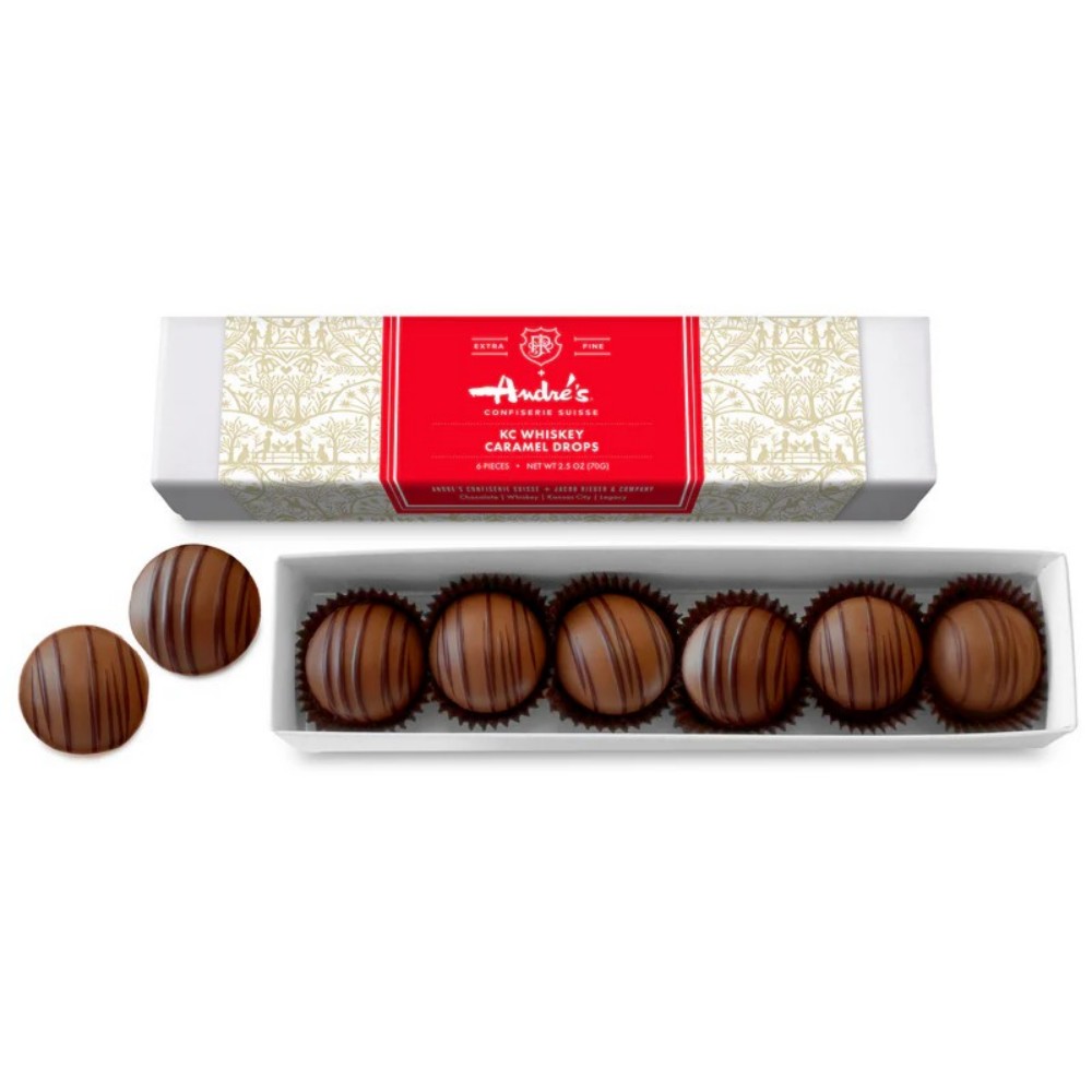
A logo is important, but it is only one part of a brand identity. Fonts, background colors, patterns, icons, illustrations, and even small design details can affect how the finished box looks.
For a successful collaboration, designers should consider how all of these elements interact. If one brand uses a minimalist style and the other uses bold graphics, the packaging needs a visual language that connects the two.
Choosing the Right Color System
Digital artwork can be displayed in RGB, while professional printing commonly relies on CMYK or other color systems. Depending on the project, brands may also use Pantone references when a particular color needs to be reproduced as consistently as possible.
This technical step may not sound exciting, but it can save a lot of frustration later. A color that looks perfect on a phone screen may print differently on paperboard. Checking color references before mass production helps reduce surprises.
Testing Before Large-Scale Production
A proof or sample is worth the extra attention. It gives the brand and its collaboration partner a chance to review the actual material, color, artwork, and finishing before placing a larger order.
Small differences can become much more noticeable when the packaging is produced in large quantities. Reviewing a physical sample also helps teams judge things that a digital mockup cannot fully show, such as texture, gloss, embossing, and how the colors react to the box material.
Retail Partnerships
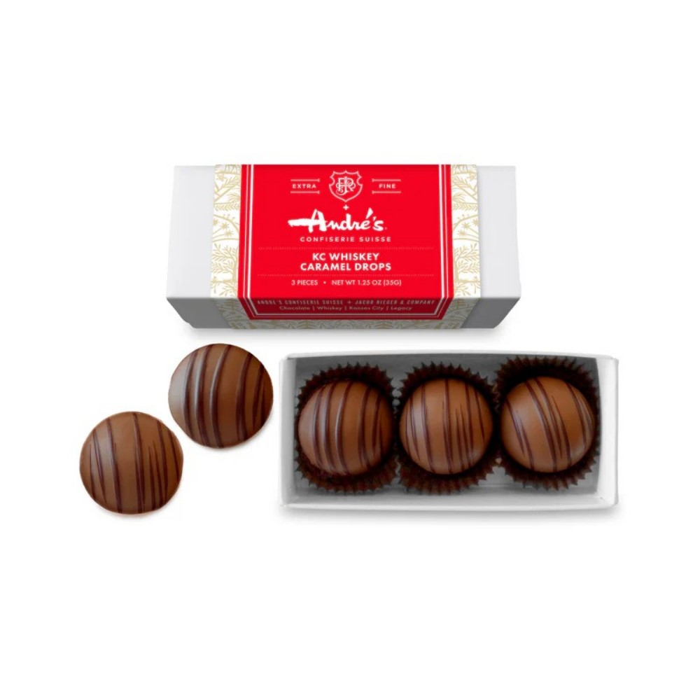
Retail collaborations often need packaging that can stand out on a shelf while still fitting the visual language of both brands. A strong color block, clean logo placement, and clear product information can help the box communicate quickly.
For retail, practicality matters too. The box needs to be durable, easy to stack, and suitable for transportation. Beautiful artwork is useful, but it should not come at the expense of function.
Corporate and Promotional Gifts
Chocolate is a popular choice for business gifting because it feels personal without being overly complicated. Custom Chocolate Boxes can turn a standard gift into something that feels specifically created for an event, company, or client.
A company might add its logo, campaign slogan, brand colors, or a short message. For larger events, the packaging can also be coordinated with invitations, displays, gift bags, and other printed materials.
Limited Editions and Seasonal Campaigns
Limited-edition packaging gives brands more freedom to experiment. A classic chocolate company might introduce a bright summer palette, metallic holiday accents, or artwork created by a guest designer.
Because the product is temporary, the packaging can feel more playful and collectible. This is also where color accuracy becomes especially important. If the campaign has a carefully developed visual concept, the printed box should reflect that concept as closely as possible.
Flexible Box Structures
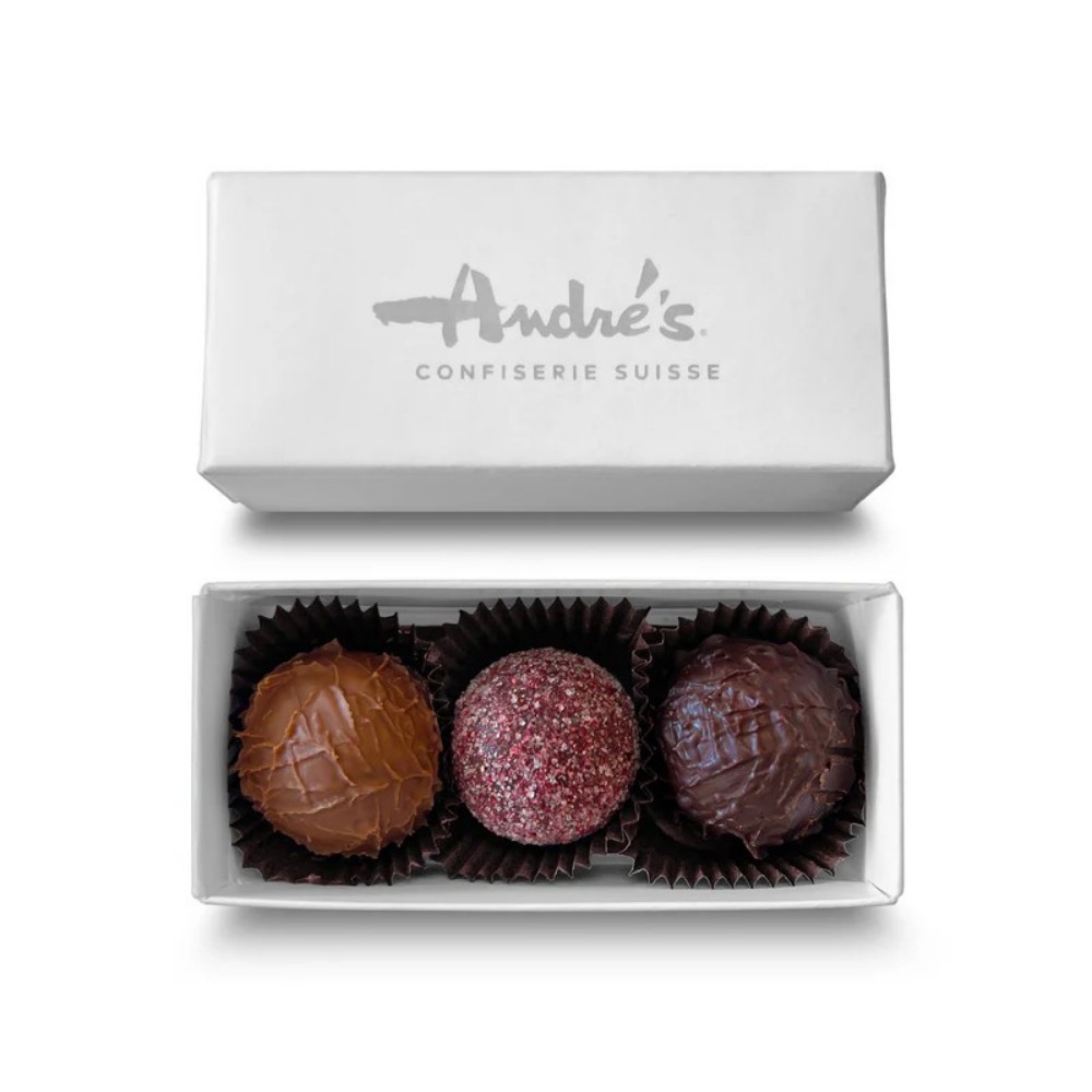
A collaboration may require different chocolate counts, shapes, or presentation styles. Common structures include drawer boxes, folding cartons, rigid boxes, sleeve-and-tray designs, and magnetic-closure boxes.
The right structure depends on the product and budget. A simple folding carton may work well for a retail campaign, while a rigid magnetic box could be more suitable for premium gifting.
Custom Inserts for Better Presentation
The inside of the package deserves just as much attention as the outside. Inserts can keep individual chocolates separated and prevent movement during shipping.
They can also improve the unboxing experience. When the lid opens and every chocolate is neatly positioned, the product immediately feels more intentional. Inserts can be made in different materials and customized to match the overall packaging design.
Finishing Details That Add Character
Color printing creates the foundation, but finishing can take the package further. Foil stamping, embossing, debossing, spot UV, soft-touch coatings, and textured papers are all options worth considering.
The key is not to use every technique at once. A subtle metallic logo or a small embossed pattern can sometimes create more impact than an overloaded design. For collaborative packaging, restraint is often useful because it gives both brand identities enough breathing room.
Brands Want Packaging That Can Adapt
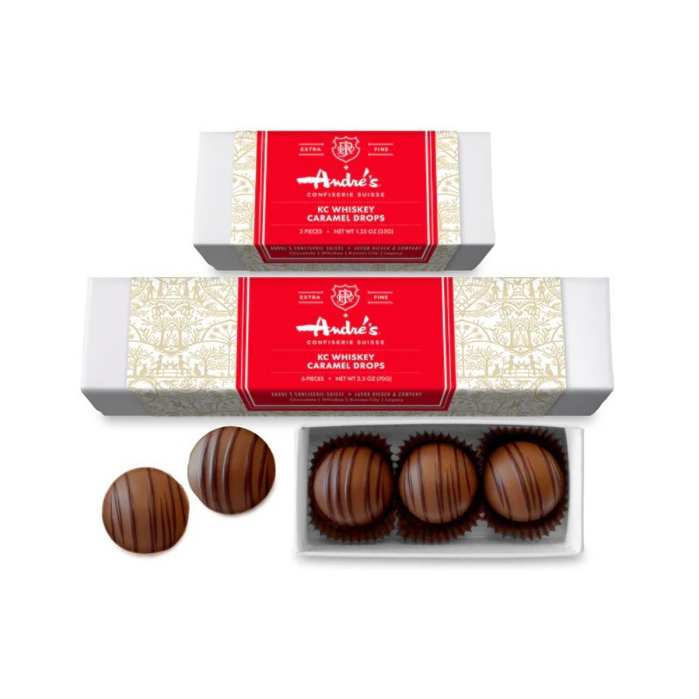
Modern campaigns move quickly. A chocolate brand may collaborate with a hotel one month, an artist the next, and a corporate customer after that. Packaging needs to adapt without losing the core identity of the product.
A modular approach can help. The basic box structure can remain consistent while colors, graphics, sleeves, labels, and inserts change according to the campaign.
Personalization Can Make Small Runs More Valuable
Digital printing and flexible production methods are making smaller packaging runs more practical for many businesses. This opens the door to personalized chocolate boxes for weddings, business events, influencer campaigns, product launches, and special customer groups.
Instead of producing one generic package for everyone, brands can create several targeted versions while keeping the overall visual identity connected.
Sustainability Is Becoming Part of the Design Brief
Collaboration packaging is also being influenced by sustainability concerns. Brands are increasingly looking at recyclable paperboard, reduced plastic, responsible materials, and packaging designs that avoid unnecessary components.
The challenge is finding a balance between appearance, protection, functionality, and environmental considerations. A beautifully designed box still needs to protect the chocolates and make sense for the product's actual supply chain.
Color-exact Custom Chocolate Boxes are more than attractive containers. They can become an important part of a collaboration strategy, helping different brands share one physical product while maintaining a clear and professional identity. From accurate color matching and flexible structures to custom inserts and premium finishes, every detail can influence the final impression.
For brands planning a collaboration, the smartest starting point is a clear creative brief. Define the brand colors, artwork, box structure, materials, finishing requirements, budget, and production timeline before moving forward. Then request a physical sample and review it with every key stakeholder.
The best collaborative packaging does not make one brand disappear behind another. Instead, it creates a visual connection between them. With thoughtful design and reliable color control, Custom Chocolate Boxes can turn a simple chocolate gift into a memorable part of a campaign, event, partnership, or product launch.
Custom Chocolate Boxes are specially designed chocolate packages created around a brand, event, campaign, or collaboration. They can be customized with brand colors, logos, artwork, box structures, inserts, and finishing effects. This makes them useful for retail products, corporate gifts, seasonal collections, and co-branded chocolate campaigns.
Color accuracy helps maintain a consistent brand identity across different marketing materials and packaging. A specific brand color can look different depending on the printing process, paperboard, coating, or display screen. Using approved color references and reviewing physical samples can help ensure the finished Custom Chocolate Boxes closely match the intended design.
Yes. Custom Chocolate Boxes are well suited to co-branding projects because the packaging can combine two or more visual identities. Logos, colors, patterns, and campaign graphics can be arranged to give each partner a clear presence while keeping the overall design balanced and cohesive.
Depending on the manufacturer, brands can customize the box shape, size, material, printing, inserts, and finishing. Popular options include rigid boxes, folding cartons, drawer boxes, sleeves, magnetic closures, foil stamping, embossing, debossing, spot UV, and soft-touch coatings. The best combination depends on the product, target audience, budget, and desired presentation.
Start with accurate artwork, approved brand colors, and clear production specifications. It is also helpful to request a physical proof before beginning a large production run. Checking the sample for color, material, dimensions, artwork placement, and finishing details gives the brand team an opportunity to make adjustments before the full order is produced.
Post time: Sep-16-2026


